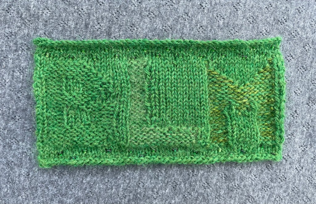
This is a good step foward. Emphatically not there yet, but the letters that incorporated an extra strand, L and especially M, are visible.
First, the things that went well. I like the beads. I used three colours in the bottom section, and just one in the top. A single colour is better. And I’m taking back what I said in the previous post about not giving the background jazz hands. With one colour, I think beads in all areas of the background could actually help to define the letters.
Swapping between single and dual strands turned out to be very easy once I left the additional strands at the front of the work rather than taking them back with the main yarn every time I went out of reverse stocking. But swapping between one and two strands did make it harder to avoid the usual risk of wobbly tension in a rib (see up the right side of L’s stalk). That said, the top curve of the B – where there is only one yarn – looks suspicious too. Probably just as well it’s barely visible. Single-yarn summarily ditched.
As I say, the M is most successful, so the lovely Rowan Kidsilk Haze that I added to the L is also ditched (expensive test!) That leaves just the equally lovely Ainworth and Prin Merino Silk to carry the flag in the extra-strand stakes. In life the M is less discernible than appears in the close-up image and the yellow tones aren’t quite right for the hedge, so I need to keep pushing things. I’ll leave the Malachite Table out of the next test so I can try new things.
For that test I’ll team up the main yarn with a strand of darker yarn. It goes against sense because the shadows cast by the BLM letters make the background darker not lighter. But it wouldn’t help the problem if I were to make the background shade darker and carry that through the letters with a lighter shade, so let’s go with seeing if I can simply make the letters stronger.
Finally, despite what I said in the previous post, I’m going to do a little intarsia, just to compare the impacts. If it’s better, it’s better. Definitely not doing a textured knit (which is what I said about intarsia).
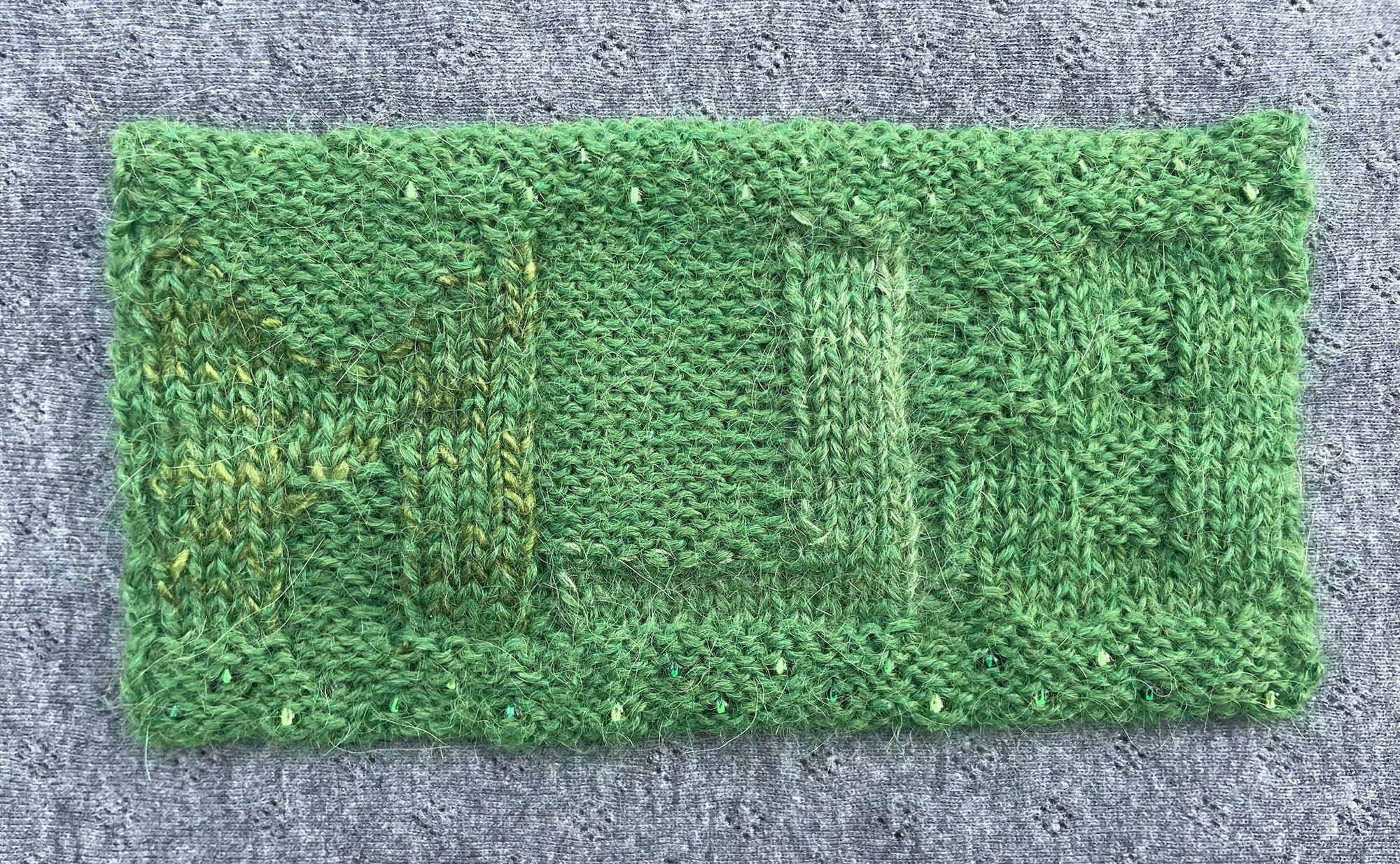
Jury is still out over which side of the knitting is best. (I’m not writing out the tongue twister again). Here is the reverse side of the swatch. Although the letters stand prouder here, for now I think the other side is better.
Resources
- Adriafil Sierra Andina, shade Grass Green (36)
- Rowan Kidsilk Haze, shade Olive (721)
- Ainworth and Prin Merino Silk, shade Malachite Table
- Debbie Abrahams beads, shades Green (49), Emerald (52), Holly (53)
- 3.25mm knitting needles
What I did
- Using Grass Green cast on 45 stitches.
- Knitted 5 rows, incorporating the three shades of bead across rows 3 and 5, in a zigazag pattern.
- Following a slightly amended chart, I picked out the letters from a stocking stitch background using reverse stocking stitch, using only Grass Green for B, then adding a strand of Olive to Grass Green for L and a strand of Malachite Table for M.
- Knitted 4 more rows after the letters, incorporating just Green beads across rows 1 and 3, in a zigazag pattern.
- Cast off.
For Test 3
- Use 3.25mm needles again. Sizing is good.
- Knit the B in reverse stocking stitch using Grass Green with a strand of Rowan Handknit Cotton, shade North Sea 371. (Weird name given that it’s a forest green. Thinks … did I misplace a yarn band in my stash? No forest green shade available online so I guess not.)
- Knit the L in reverse stocking stitch using Grass Green with a strand of Rowan Kidsilk Haze, shade Smoke (605).
- Knit the M with intarsia using Rowan Felted Tweed, shade Celadon (184).
- Add beads to all the background area, using Green for half the swatch and Emerald for the other.
- Expect to be bamboozled by so many bobbins doing different things. Also expect to need yet another test (sigh)


Leave a Reply