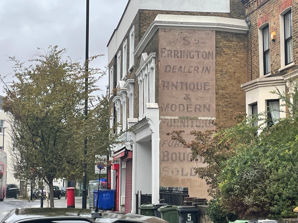
I don’t know when S Errington painted this sign onto the side of the antique shop where it jutted out from the terrace at the northern end of Dulwich Road, but it has clung to the building ever since.
The site was still trading when we moved into the area 30+ years ago, but not in antiques. In my foggy memory it was an old-fashioned corner shop but, whether that or something else, trade was very slow and the shop eventually closed forever. It is now a house.
The old sign is a must for the blanket. I’m hoping to place it in opposition to the Escher-style Phlegm mural, although I’ve had no response from the street artist as to whether I will have the right to feature it so I may have to find something else for balance.
I previously said that designing the S Errington square ‘should be relatively simple’, betraying just how little I knew about charting a pattern at the time. I might have been correct if the antiques trader had been a cooperative Smith or Jones, but no, I have a single initial followed by a name that is impossibly long for the intended shape, and lots of blank space. What to do?
One solution was to crop my photo of the sign into a square, as below, and to knit only what appears inside the square. But even as I made the crop I could see that designing part letters would be hard and in any case the image has no integrity.
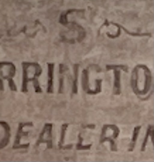
Next, I thought of reproducing just a word or words that might fit relatively well into a square – ‘bought or sold’, perhaps, ‘antique’, ‘dealer’, ‘modern’. Ok I guess, but ultimately disappointing because all these words could appear anywhere. Only the name ‘S Errington’ is tied to this sign in this place, so it’s what I want in the blanket.
I scratched my head after that, for some weeks. Then I hit on the idea of deconstructing the name so it can fit into a square. If I let go of direct replication so the name becomes an abstract, I think it can have an internal integrity that the cut-out square was missing. I’ve decided to proceed with this and here’s a rough sketch that I’m now turning into a chart.
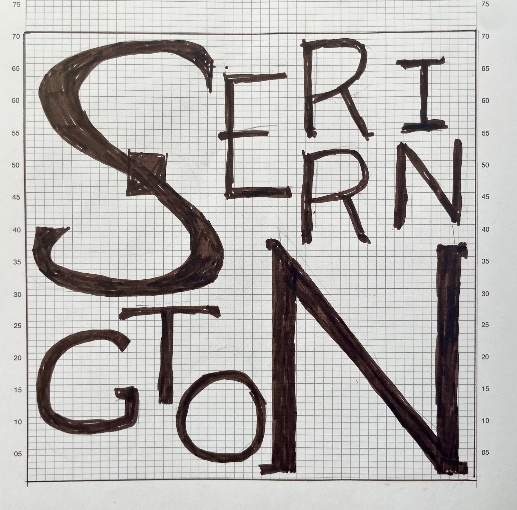
The text isn’t straightforward to decode, but I don’t think I mind that, although the arrangement of letters must be improved upon. I’ll try swapping the lower R with the I and/or move the small N into the space above the big N. Fun to be had in all cases. I will add a pale ‘shadow’ to the large S and N, as in the sign itself, but not to the smaller letters.
I think this has to be yet another piece of intarsia as a stranded piece of knitting would involve very long floats. I’ll see.


Leave a Reply