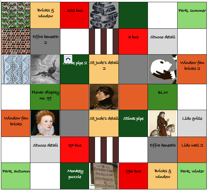
Things have moved on quite a way from Layout 1. I’ve eased up on making everything perfectly symmetrical, and introduced a few more shades and ideas for squares.
Looks like a hot mess, doesn’t it.
Problems, questions and opportunities
(1) Too many ideas involve stranded knitting or intarsia, making lots of ‘pictures’ that will be tiresome to look at. The three completed squares in the top left of the layout show the problem. The busy Lido Wall and Park squares clash horribly. And in taking care to render the colours and feel of the real features, both squares are darker than intended in the layout, with a heavy quality. I’ll need more calm spots, more light and bright, more single-colour and textured squares, like the Grille. For now, I can alter the layout so the Grille would sit between Park and Wall in the top left of the blanket, and do similar around the other corner squares. But I must rethink the whole colour balance.
(2) It’s hard to visualise colours across the entire layout until I’ve decided on the background colours for the 7 key intarsia features:
- the four Poet’s Corner roads illustrated by characters from their texts:
- Chaucer Road: mounted pilgrim. Canterbury Tales
- Spenser Road: Elizabeth I, The Faerie Queene
- Shakespeare Road: Yorick’s skull in hand, Hamlet
- Milton, Satan falling: Paradise Lost
- Prince Regent pub, centre
- the mural by street artist Phlegm (must clarify copyright for any knitting chart), top middle
- S Errington wall advert, bottom middle.
I think the mural and wall advert will be on a cream/beige background, as they are in life, but in principle I could do what I like with the others. I’ll go back to the layout grid, remove the images from those squares and play with base colours to see what could work. And, for now, let’s just pretend that designing a 7×7-inch knitting chart for Elizabeth I’s head or Satan falling from heaven will be absolutely no challenge at all.
(3) Avoiding ‘pictures’ elsewhere is not so easy. Dulwich Road isn’t especially long so there is only so much to work with, however interesting it may be. As I said in an earlier post, there isn’t the nuance you can find in nature, or the organic shapes. Many features that make an urban neighbourhood are specific landmarks that are hard to indicate through loose representation. At least for my baby designing brain. For instance, how to include recognisable shops without using their logos? (See What’s in a square (3)?)
Perhaps I should rethink the park squares, make them less busy, more notional, because that could easily be possible – but after all the work on Park Entrance in Spring, I’m not running towards this solution. An alternative is to lift the colour palette for the park squares, especially by using a lighter colour for the leaf overlay. I can trial that when I come to the Park in Summer and redo Spring if needed.
(4) Another way of bringing more light is to acknowledge that the sky is always present in any experience of Dulwich Road. For the blanket, it could offer the chance for textured knitting using the sky shades found in the park squares.
(5) I really want to include hot red bus squares, and I’m even thinking of adding two postboxes to bring in more red. One bears George VI’s cyper, which could be fun (though another picture, Pat). But I’ve been struggling for a week to render the buses in a way that isn’t cartoonish, especially if I include the four bus numbers. Ideas to break up red with the black, white and chrome of the buses, for instance in a kind of plaid, feel too contrived. But then all-red squares could be just too much. So I’ve parked the buses for now. (Sorry.)
(6) I do already have potential for more flexibility on colour and approach. There isn’t enough white in the layout – the stucco really is everywhere – and I haven’t yet included all the ideas set out in What’s in a square (3)? There is stuff to play with.
Where now?
All these issues are buzzing in my head, crowding out creative ideas. If you have any suggestions, I’d welcome them.
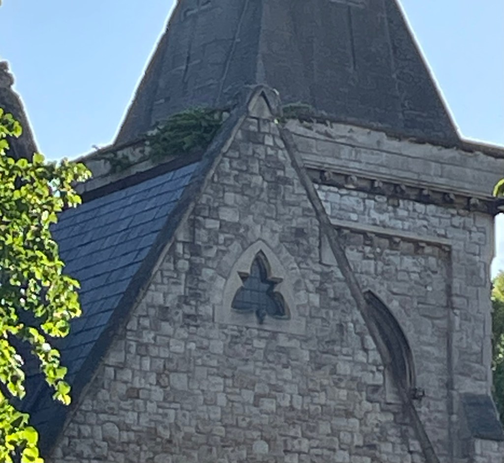
While I’m trying to resolve all this, I’ll move on to either the BLM square (see pic here) or the small St Jude’s Church detail in the main image. I think the first will be simple knit-purl textured lettering in green, perhaps with some beads, and the second a small repeated pattern in pale shades.
Watch this space.

Leave a comment